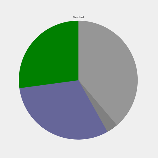
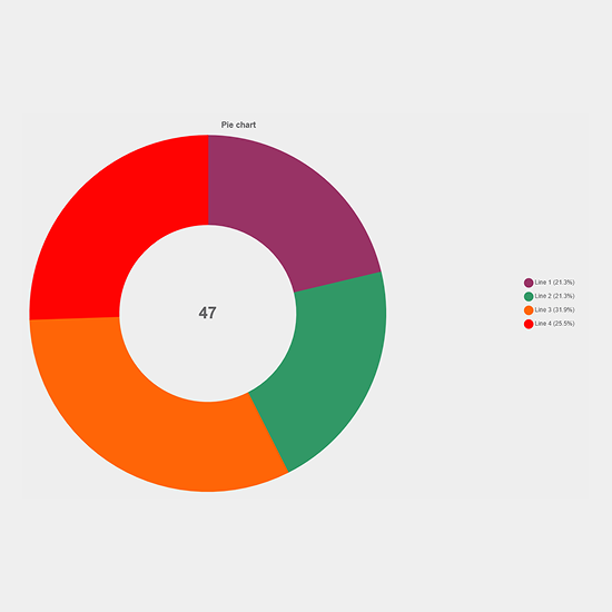
Pie/Doughnut Chart
Zero configuration • Built for industrial dashboards
Professional circular chart for visualizing proportional data distribution.
Compatibility
- Unified PC Runtime
- Unified Comfort Panels
Use cases
- Distribution Analysis
- Resource Allocation
- Production Mix Monitoring
What's included?
- Unlimited Usage
- Email Support
- Lifetime Updates
Documentation
Pie/Doughnut Chart
A versatile circular chart component for WinCC Unified that displays data as proportional segments of a circle. Ideal for visualizing distribution data, resource allocation, production mix ratios, and percentage-based metrics in industrial automation and SCADA applications.
Overview
The Pie/Doughnut Chart component provides professional circular data visualization with flexible support for multiple segments (recommended maximum of 8). It offers two display modes: solid pie chart for straightforward proportion display, and doughnut chart with customizable center text for enhanced information density. Built on Chart.js, it integrates seamlessly with WinCC Unified runtime for real-time process monitoring and distribution analysis. The component uses array-based properties for data, labels, and colors, allowing dynamic configuration through screen scripts.
Component Type
Data Visualization Control / Distribution Display
Key Features
- Dual Modes: Toggle between pie and doughnut chart styles
- Flexible Segments: Support for variable number of segments (up to 8 recommended) using array properties
- Array-Based Configuration: Data, Labels, and Colors properties use structured arrays for easy dynamic updates
- Center Text: Display custom text or total value in doughnut center
- Interactive Legend: Color-coded legend with optional percentage display
- Dynamic Updates: Real-time data updates with smooth animations
- Flexible Cutout: Adjustable inner radius (0-90%) for doughnut thickness control
- Auto-Hide: Segments with zero values automatically hidden
- Responsive Design: Adapts to component size with optimal layout
- Script-Friendly: Properties designed for easy manipulation via WinCC Unified screen scripts
Properties
Title
- Type:
string - Category: Appearance
- Description: The text displayed at the top of the chart
- Usage: Set this property to identify the distribution or data category being visualized
- Default:
"Pie/Doughnut Chart" - Example:
"Production Mix","Resource Distribution","Product Categories" - Note: Title appears above the chart with bold styling
ChartType
- Type:
string - Category: Appearance
- Description: Determines whether to display as a solid pie or ring-style doughnut chart
- Usage: Select visualization style based on information density needs
- Default:
"doughnut" - Values:
"pie"- Solid circle with segments radiating from center (no center hole)"doughnut"- Ring chart with center cutout allowing center text display
- Use Cases:
- Use
"pie"for simple proportion visualization - Use
"doughnut"when displaying center text or total values - Use
"doughnut"for modern, professional appearance
- Use
- Note: Changing ChartType triggers chart rebuild with current data
Data
- Type:
arrayof objects withValueproperty - Category: Data
- Description: Array defining numeric values for each segment determining proportional sizes
- Usage: Configure segment values to represent quantities, percentages, or counts from your process
- Default:
[ { Value: 30 }, { Value: 25 }, { Value: 20 }, { Value: 15 }, { Value: 10 } ] - Structure: Each array item is an object with a
Valueproperty (number) - Valid Values: Any non-negative number (0 or greater) for each Value property
- Behavior:
- Array items with value
0are automatically hidden from display - Segment size calculated as proportion of total sum of all visible segments
- Values can be absolute quantities or pre-calculated percentages
- Maximum recommended array length: 8 items (segments)
- Array items with value
- Performance: Real-time updates trigger smooth chart transitions
- Example:
[
  { Value: 450 },  // Product A production
  { Value: 350 },  // Product B production
  { Value: 200 },  // Product C production
  { Value: 0 }     // Hidden segment
]
Labels
- Type:
arrayof objects withTextproperty - Category: Data
- Description: Array defining text labels for each segment in the legend and tooltips
- Usage: Provide descriptive names for data categories corresponding to Data array items
- Default:
[ { Text: "Segment 1" }, { Text: "Segment 2" }, { Text: "Segment 3" }, { Text: "Segment 4" }, { Text: "Segment 5" } ] - Structure: Each array item is an object with a
Textproperty (string) - Example Values:
[ { Text: "Product A" }, { Text: "Product B" }, { Text: "Product C" } ] - Best Practice:
- Keep labels concise (under 20 characters) for legend readability
- Array length should match Data array length
- Labels appear in legend and hover tooltips with corresponding colors
- Note: If Labels array is shorter than Data array, default labels "Segment N" are used for missing entries
Colors
- Type:
arrayof objects withColorproperty - Category: Appearance
- Description: Array defining fill colors for each segment
- Usage: Assign distinct colors to differentiate segments or match corporate/process color standards
- Default:
[ { Color: 4283215696 }, // Blue - RGB 54, 162, 235 { Color: 4283782485 }, // Green - RGB 75, 192, 192 { Color: 4294936576 }, // Orange - RGB 255, 159, 64 { Color: 4294923520 }, // Red - RGB 255, 99, 132 { Color: 4287889619 } // Purple - RGB 153, 102, 255 ] - Structure: Each array item is an object with a
Colorproperty (number representing ARGB value) - Format: WinCC Unified ARGB color value as 32-bit integer
- Best Practice:
- Use contrasting colors for adjacent segments to ensure clear visual separation
- Array length should match Data array length
- Use standard status colors: Green=normal, Yellow=warning, Red=alarm
- Maintain consistent color coding across related displays
- Use fully opaque colors (alpha = 255) for segments
- Example:
[
  { Color: 4278255360 },  // Green for normal production
  { Color: 4294944000 },  // Orange for warnings
  { Color: 4294901760 }   // Red for alarms
]
CutoutPercentage
- Type:
number - Category: Appearance
- Description: Controls the inner radius size as percentage of total radius
- Usage: Adjust doughnut thickness or convert between pie and ring styles
- Default:
50 - Valid Range:
0to90(clamped automatically by component)0- Solid pie chart (no center hole)30-50- Thick doughnut ring50-70- Medium doughnut ring (recommended)70-90- Thin doughnut ring
- Best Practice: Values between 50-70 provide optimal balance between segment visibility and center text space
- Note: Only effective when ChartType is set to
"doughnut" - Example: Set to
60for standard doughnut,80for thin ring style
ShowLegend
- Type:
boolean - Category: Appearance
- Description: Controls visibility of the color-coded legend panel
- Usage: Toggle legend display based on space availability and label importance
- Default:
true - Values:
true- Display legend on right side with segment labels and colorsfalse- Hide legend (useful when labels are shown elsewhere or space is limited)
- Legend Features:
- Color-coded markers matching segment colors
- Segment labels with optional percentages
- Right-aligned positioning for optimal space usage
- Best Practice: Enable for clarity unless segment meanings are obvious from context
- Note: Legend updates automatically when segment data changes
ShowPercentages
- Type:
boolean - Category: Appearance
- Description: Controls whether percentage values appear in legend labels and tooltips
- Usage: Enable to show exact proportional distribution alongside visual representation
- Default:
true - Values:
true- Display percentages next to labels (e.g., "Product A (35.5%)")false- Show only labels without percentages
- Calculation: Percentage = (SegmentValue / TotalOfAllSegments) * 100
- Format: Displayed with one decimal place precision (e.g., "42.3%")
- Best Practice: Enable when precise distribution values are important for decision-making
- Note: Percentages automatically recalculate when any segment value changes
CenterText
- Type:
string - Category: Appearance
- Description: Custom text to display in the center of doughnut charts
- Usage: Show total values, KPIs, status text, or contextual information
- Default:
""(empty - displays total sum of all segments) - Behavior:
- When empty: Displays calculated total of all segment values
- When set: Displays custom text exactly as provided
- Only visible in doughnut mode with CutoutPercentage > 20
- Example Values:
"100%"- Display as percentage"Total"- Label for total value"1000 Units"- Total with unit"Active"- Status indicator
- Font Sizing: Automatically scales to fit center area (maximum 32px)
- Best Practice: Keep text short (under 15 characters) for optimal display
- Note: Not visible when ChartType is
"pie"or CutoutPercentage is very small
ForegroundColor
- Type:
Color(number) - Category: Appearance
- Description: Color used for chart title, legend labels, center text, and tooltips
- Usage: Set to ensure text readability against the chart background
- Default:
4294967295(white - RGB 255, 255, 255) - Format: WinCC Unified ARGB color value as 32-bit integer
- Applies To:
- Chart title text
- Legend labels and percentages
- Center text in doughnut mode
- Tooltip text
- Best Practice: Use high contrast with ChartBackgroundColor for operator visibility
- Common Values:
4294967295(white) for dark backgrounds4278190080(black) for light backgrounds4289374890(light gray) for medium backgrounds
ChartBackgroundColor
- Type:
Color(number) - Category: Appearance
- Description: Background color for the entire chart component area
- Usage: Match the chart background to your HMI screen design and color scheme
- Default:
4280361249(dark gray - RGB 33, 37, 41) - Format: WinCC Unified ARGB color value as 32-bit integer
- Note: This color fills the canvas behind the chart, legend, and title
- Best Practice: Use dark backgrounds to reduce operator eye strain in 24/7 monitoring environments
- Common Values:
4280361249(dark gray) - professional appearance4278190080(black) - high contrast for alarms4294967295(white) - documentation or reports0(transparent) - blend with screen background
Data Structure Details
Array-Based Configuration
The component uses three synchronized array properties (Data, Labels, Colors) that work together:
// Complete chart configuration
Data = [
  { Value: 450 },
  { Value: 350 },
  { Value: 200 }
]

Labels = [
  { Text: "Product A" },
  { Text: "Product B" },
  { Text: "Product C" }
]

Colors = [
  { Color: 4283215696 },  // Blue
  { Color: 4283782485 },  // Green
  { Color: 4294936576 }   // Orange
]
Key Principles:
- Arrays are zero-indexed (first element at index 0)
- All three arrays should have matching lengths for consistent display
- Array elements at the same index represent one segment (Data[0], Labels[0], Colors[0])
- Segments with value 0 are automatically excluded from display
- Maximum recommended array length: 8 elements (segments)
- Total chart represents sum of all non-zero Data values
Segment Value Interpretation
The component calculates proportions automatically:
// Example with 3 active segments
Data = [
  { Value: 30 },  // Will display as 30/(30+50+20) = 30%
  { Value: 50 },  // Will display as 50/(30+50+20) = 50%
  { Value: 20 },  // Will display as 20/(30+50+20) = 20%
  { Value: 0 }    // Hidden (not displayed)
]
Calculation Logic:
- Total = Sum of all Data[i].Value where Value > 0
- Percentage = (Data[i].Value / Total) * 100
- Segment arc angle = (Data[i].Value / Total) * 360 degrees
Usage Examples
Basic Production Mix Distribution
// Show distribution of 4 product types
Title = "Production Mix - Shift 1"
ChartType = "pie"

Data = [
  { Value: 450 },
  { Value: 350 },
  { Value: 275 },
  { Value: 125 }
]

Labels = [
  { Text: "Product A" },
  { Text: "Product B" },
  { Text: "Product C" },
  { Text: "Product D" }
]

Colors = [
  { Color: 4283215696 },  // Blue
  { Color: 4283782485 },  // Green
  { Color: 4294936576 },  // Orange
  { Color: 4294923520 }   // Red
]

ShowLegend = true
ShowPercentages = true
Doughnut Chart with Total Display
// Resource utilization with total in center
Title = "Resource Utilization"
ChartType = "doughnut"
CutoutPercentage = 60

Data = [
  { Value: 720 },  // Running hours
  { Value: 120 },  // Idle hours
  { Value: 80 },   // Maintenance
  { Value: 80 }    // Stopped
]

Labels = [
  { Text: "Running" },
  { Text: "Idle" },
  { Text: "Maintenance" },
  { Text: "Stopped" }
]

Colors = [
  { Color: 4278255360 },  // Green
  { Color: 4294944000 },  // Orange
  { Color: 4278190335 },  // Blue
  { Color: 4294901760 }   // Red
]

// Center shows total hours (720+120+80+80 = 1000)
CenterText = ""  // Empty shows calculated total
ShowPercentages = true
Custom Center Text for KPI Display
// Efficiency percentage as center text
Title = "Overall Equipment Efficiency"
ChartType = "doughnut"
CutoutPercentage = 70

Data = [
  { Value: 85 },
  { Value: 15 }
]

Labels = [
  { Text: "Productive" },
  { Text: "Downtime" }
]

Colors = [
  { Color: 4278255360 },  // Green
  { Color: 4294901760 }   // Red
]

CenterText = "85% OEE"  // Custom KPI display
ShowLegend = true
ShowPercentages = false  // Hide percentages in legend
Material Distribution Analysis
// Track inventory distribution across zones
Title = "Warehouse Material Distribution"
ChartType = "doughnut"
CutoutPercentage = 55

Data = [
  { Value: 1250 },
  { Value: 980 },
  { Value: 750 },
  { Value: 620 },
  { Value: 400 }
]

Labels = [
  { Text: "Zone A" },
  { Text: "Zone B" },
  { Text: "Zone C" },
  { Text: "Zone D" },
  { Text: "Zone E" }
]

Colors = [
  { Color: 4283215696 },
  { Color: 4283782485 },
  { Color: 4294936576 },
  { Color: 4294923520 },
  { Color: 4287889619 }
]

CenterText = "Total"
ShowLegend = true
ShowPercentages = true
ChartBackgroundColor = 4278190080  // Black
ForegroundColor = 4294967295       // White
Dynamic Tag Binding Example
// Real-time process state monitoring
// Note: WinCC Unified does not support direct tag binding to array properties
// Use screen scripts to update arrays based on PLC tags

Title = "Machine State Distribution"

// In screen script, update arrays from PLC tags
Data = [
  { Value: "PLC_1"."StateTime_Running" },
  { Value: "PLC_1"."StateTime_Idle" },
  { Value: "PLC_1"."StateTime_Alarm" },
  { Value: "PLC_1"."StateTime_Maintenance" }
]

Labels = [
  { Text: "Running" },
  { Text: "Idle" },
  { Text: "Alarm" },
  { Text: "Maintenance" }
]

Colors = [
  { Color: 4278255360 },  // Green - Running
  { Color: 4294944000 },  // Orange - Idle
  { Color: 4294901760 },  // Red - Alarm
  { Color: 4278190335 }   // Blue - Maintenance
]

// Dynamic center text showing current state
CenterText = "PLC_1"."CurrentStateText"

ChartType = "doughnut"
ShowPercentages = true
Quality Distribution Tracking
// Production quality breakdown
Title = "Production Quality Analysis"
ChartType = "pie"

Data = [
  { Value: 9500 },  // Good parts
  { Value: 350 },   // Minor defects
  { Value: 150 }    // Major defects
]

Labels = [
  { Text: "Good" },
  { Text: "Minor Defects" },
  { Text: "Major Defects" }
]

Colors = [
  { Color: 4278255360 },  // Green
  { Color: 4294944000 },  // Orange
  { Color: 4294901760 }   // Red
]

ShowPercentages = true
ShowLegend = true
Multi-Segment Resource Allocation
// Budget or resource allocation display
Title = "Project Resource Allocation"
ChartType = "doughnut"
CutoutPercentage = 50

Data = [
  { Value: 25000 },
  { Value: 18000 },
  { Value: 15000 },
  { Value: 12000 },
  { Value: 10000 },
  { Value: 8000 },
  { Value: 7000 },
  { Value: 5000 }
]

Labels = [
  { Text: "Engineering" },
  { Text: "Manufacturing" },
  { Text: "Testing" },
  { Text: "Documentation" },
  { Text: "Training" },
  { Text: "Support" },
  { Text: "Maintenance" },
  { Text: "Administration" }
]

Colors = [
  { Color: 4283215696 },
  { Color: 4283782485 },
  { Color: 4294936576 },
  { Color: 4294923520 },
  { Color: 4287889619 },
  { Color: 4278233343 },
  { Color: 4294951115 },
  { Color: 4289309097 }
]

CenterText = "100K"  // Total budget
ShowPercentages = true
ShowLegend = true
Pie vs Doughnut Mode
When to Use Pie Chart
Best For:
- Simple 2-4 segment distributions
- When center text is not needed
- Emphasizing the "whole" concept
- Traditional report-style visualizations
- Maximum segment area visibility
Advantages:
- Maximizes segment size for small component areas
- Familiar, universally understood format
- Simple, clean appearance
- Better for print documentation
Configuration:
ChartType = "pie"
// CutoutPercentage ignored in pie mode
// CenterText not visible in pie mode
When to Use Doughnut Chart
Best For:
- Displaying 3-8 segments with varying sizes
- When center text adds valuable context
- Modern, professional HMI designs
- Showing totals or KPIs in center
- Multi-level information display
Advantages:
- Center area available for critical information
- Modern, professional appearance
- Better segment separation in crowded displays
- Adjustable ring thickness via CutoutPercentage
- Reduces visual weight in busy screens
Configuration:
ChartType = "doughnut"
CutoutPercentage = 60  // Adjust thickness
CenterText = "Total"   // Utilize center space
Comparison Summary
| Aspect | Pie Chart | Doughnut Chart | |--------|-----------|----------------| | Segment Area | Maximum | Reduced by cutout | | Center Text | Not visible | Fully supported | | Visual Weight | Heavier | Lighter, modern | | Segment Count | 2-4 optimal | 3-8 optimal | | Use Case | Simple distributions | Complex distributions | | Information Density | Lower | Higher with center text |
Color Format Reference
WinCC Unified uses 32-bit ARGB color values:
- Format:
0xAARRGGBB - A: Alpha (transparency) -
00(transparent) toFF(opaque) - R: Red component -
00toFF - G: Green component -
00toFF - B: Blue component -
00toFF
Conversion Formula:
DecimalValue = (A * 16777216) + (R * 65536) + (G * 256) + B
Standard Process Colors:
- Green (Normal):
4278255360(0xFF00FF00) - Yellow (Warning):
4294944000(0xFFFFA500) - Red (Alarm):
4294901760(0xFFFF0000) - Blue (Info):
4278190335(0xFF0000FF) - Gray (Inactive):
4286611584(0xFF808080) - White (Text):
4294967295(0xFFFFFFFF) - Black (Background):
4278190080(0xFF000000)
Default Segment Colors (as decimal values):
- Blue:
4283215696(0xFF36A2EB) - Green:
4283782485(0xFF4BC0C0) - Orange:
4294936576(0xFFFF9F40) - Red:
4294923520(0xFFFF6384) - Purple:
4287889619(0xFF9966FF) - Cyan:
4278233343(0xFF00FFFF) - Pink:
4294951115(0xFFFFCD56) - Teal:
4289309097(0xFF4BC0C0)
Color Selection Guidelines:
- Use fully opaque colors for segments (alpha = FF)
- Ensure adjacent segments have distinguishable colors
- Follow corporate or process color standards
- Use standard status colors (green/yellow/red) for state visualization
- Test color combinations for colorblind accessibility
Best Practices
1. Array Configuration
- Use Only Needed Elements: Include only necessary items in Data, Labels, and Colors arrays; set unused values to 0 to hide them
- Maintain Array Synchronization: Keep Data, Labels, and Colors arrays with matching lengths for consistent display
- Meaningful Labels: Use clear, concise labels in Labels array that operators understand immediately
- Color Coding: Apply consistent color schemes across all HMI screens using Colors array
- Value Ranges: Data array values can be any positive number; component calculates proportions automatically
2. Visual Design
- Limit Segments: Use 2-6 array elements for optimal readability; avoid overcrowding with too many segments
- Color Contrast: Ensure sufficient visual separation between adjacent segment colors in Colors array
- Legend Placement: Enable ShowLegend unless segment meanings are obvious
- Center Text: Use doughnut mode with meaningful center text for information density
- Sizing: Maintain minimum component size of 300x300 pixels for legend readability
3. Data Representation
- Appropriate Use Cases: Use for part-to-whole relationships, not trends over time
- Value Types: Works with absolute values, percentages, or counts in Data array
- Zero Handling: Array items with value 0 are hidden automatically
- Total Display: Leave CenterText empty to show calculated total in doughnut center
- Percentage Display: Enable ShowPercentages when exact proportions matter
4. Performance Optimization
- Update Frequency: Update Data array at 1-5 second intervals for smooth transitions
- Avoid Rapid Changes: Frequent updates to large arrays can affect rendering performance
- Script-Based Updates: Use screen scripts to build arrays from PLC tags efficiently
- Batch Updates: Update all three arrays (Data, Labels, Colors) in a single script execution when possible
5. Operator Experience
- Clear Identification: Always set descriptive Title for context
- Legend Visibility: Enable ShowLegend for unfamiliar distributions
- Percentage Display: Enable ShowPercentages for precise analysis
- Status Colors: Use green/yellow/red for state or quality distributions
- Contrast: Ensure ForegroundColor contrasts well with ChartBackgroundColor
6. Doughnut Mode Optimization
- Cutout Range: Use 50-70% for standard doughnut appearance
- Center Text Length: Keep under 10 characters for optimal font sizing
- Information Hierarchy: Use center text for most critical metric
- Thick vs Thin: Thicker rings (lower cutout) emphasize segment sizes; thinner rings (higher cutout) emphasize center content
When to Use Pie/Doughnut Charts vs Other Chart Types
Use Pie/Doughnut Charts When:
- Visualizing part-to-whole relationships
- Showing distribution across 2-8 categories
- Displaying resource allocation or utilization
- Representing market share or production mix
- Comparing proportions at a single point in time
- Space constraints favor circular layout
- Percentage-based data is primary focus
Use Bar Chart Instead When:
- Comparing discrete values without showing total
- Displaying more than 8 categories
- Showing time-series or sequential data
- Precise value comparison is more important than proportions
- Categories have very similar values (hard to distinguish in pie)
- Displaying negative values
Use Line Chart Instead When:
- Tracking trends over time
- Showing continuous data progression
- Analyzing historical patterns
- Displaying time-series measurements
- Monitoring rate of change
Use Gauge Instead When:
- Displaying single value against thresholds
- Showing percentage of target or capacity
- Monitoring real-time status with alarm levels
- Emphasizing current value over distribution
Pie/Doughnut Chart Advantages:
- Excellent for showing proportions visually
- Immediately communicates part-to-whole relationships
- Compact, circular format efficient for space
- Percentages automatically calculated and displayed
- Doughnut center provides additional information area
Pie/Doughnut Chart Limitations:
- Not suitable for more than 8 segments
- Difficult to compare similar-sized segments precisely
- Cannot show trends over time
- Not ideal for very small proportions (< 5%)
- Less effective than bars for exact value comparison
Integration with WinCC Unified
Runtime Behavior
- Component initializes on screen load with configured default values
- Property changes trigger smooth chart transitions with animation (300ms duration)
- WebCC API manages bidirectional communication with WinCC Unified runtime
- Segments with zero values automatically excluded from display
- Percentages recalculated automatically when any segment value changes
- Chart rebuilds completely when ChartType changes between pie and doughnut
Data Binding Options
Important: WinCC Unified does not support direct tag binding to array elements. You must use screen scripts to populate array properties from PLC tags.
Script-Based Array Updates:
// In screen script - build arrays from PLC tags
var dataArray = [
  { Value: Tag1 },
  { Value: Tag2 },
  { Value: Tag3 }
];
PieChart1.Data = dataArray;

// Static labels
PieChart1.Labels = [
  { Text: "Product A" },
  { Text: "Product B" },
  { Text: "Product C" }
];

// Calculate and set center text
var total = Tag1 + Tag2 + Tag3;
PieChart1.CenterText = total.ToString() + " Units";
Dynamic Color Assignment:
// Change segment colors based on status
var colorArray = [
  { Color: AlarmActive ? 4294901760 : 4278255360 },  // Red if alarm, else Green
  { Color: 4283782485 },
  { Color: 4294936576 }
];
PieChart1.Colors = colorArray;
Conditional Display:
// Show/hide segments dynamically by setting values to 0
var dataArray = [
  { Value: ShowProduct1 ? ProductionCount1 : 0 },
  { Value: ShowProduct2 ? ProductionCount2 : 0 },
  { Value: ShowProduct3 ? ProductionCount3 : 0 }
];
PieChart1.Data = dataArray;
Tag Binding Examples
Production Monitoring:
// In screen script or cyclic event
Title = "Shift Production Mix"

// Build Data array from production counters
var productionData = [
  { Value: "Production"."Count_ProductA" },
  { Value: "Production"."Count_ProductB" },
  { Value: "Production"."Count_ProductC" },
  { Value: "Production"."Count_ProductD" }
];
PieChart1.Data = productionData;

// Set static labels
PieChart1.Labels = [
  { Text: "Product A" },
  { Text: "Product B" },
  { Text: "Product C" },
  { Text: "Product D" }
];
Machine State Visualization:
// In screen script - update every second
Title = "Machine State Distribution (24h)"

// Build arrays from accumulated state times (in minutes)
PieChart1.Data = [
  { Value: "Machine_01"."StateTime_Running" },
  { Value: "Machine_01"."StateTime_Idle" },
  { Value: "Machine_01"."StateTime_Alarm" },
  { Value: "Machine_01"."StateTime_Maintenance" }
];

PieChart1.Labels = [
  { Text: "Running" },
  { Text: "Idle" },
  { Text: "Alarm" },
  { Text: "Maintenance" }
];

// Color coding by state
PieChart1.Colors = [
  { Color: 4278255360 },  // Green
  { Color: 4294944000 },  // Orange
  { Color: 4294901760 },  // Red
  { Color: 4278190335 }   // Blue
];
Dynamic Label Updates:
// In screen script - build arrays from PLC
// Update labels from tags
var labelArray = [
  { Text: "PLC_1"."ProductName_1" },
  { Text: "PLC_1"."ProductName_2" },
  { Text: "PLC_1"."ProductName_3" }
];
PieChart1.Labels = labelArray;

// Corresponding values
var dataArray = [
  { Value: "PLC_1"."ProductCount_1" },
  { Value: "PLC_1"."ProductCount_2" },
  { Value: "PLC_1"."ProductCount_3" }
];
PieChart1.Data = dataArray;
Supported Platforms
- Unified PC Runtime: Full support with hardware-accelerated canvas rendering
- Unified Comfort Panels: Optimized for embedded systems with responsive performance
- Browser Runtime: Compatible with WebView-based clients and web monitoring
Performance Characteristics
- Rendering: HTML5 Canvas-based with Chart.js 3.x optimization
- Update Rate: Supports refresh rates of 0.5-2 Hz (500-2000ms intervals recommended)
- Animation: Smooth 300ms transitions for data updates
- Memory: Efficient memory usage suitable for multiple chart instances
- Resolution: Responsive design adapts to component size (minimum 250x250px recommended)
Troubleshooting Common Issues
Chart Not Displaying or Blank Screen
Possible Causes:
- All segment values are 0
- Component size is too small (below 100x100 pixels)
- ChartBackgroundColor matches segment colors
- Component not visible or positioned off-screen
Solutions:
- Verify at least one segment has value > 0
- Increase component dimensions to minimum 250x250 pixels
- Check color settings for sufficient contrast
- Confirm component visibility and position properties
Segments Not Showing Expected Proportions
Possible Causes:
- Segment values include negative numbers (not supported)
- Values are NaN, null, or undefined
- Incorrect tag binding or data type mismatch
Solutions:
- Ensure all segment values are non-negative numbers (>= 0)
- Verify tag bindings return valid numeric values
- Check PLC tag data types match expected format
- Use default values for testing to isolate configuration issues
Center Text Not Visible
Possible Causes:
- ChartType set to "pie" instead of "doughnut"
- CutoutPercentage too low (< 20)
- ForegroundColor matches ChartBackgroundColor
- Text too long for center area
Solutions:
- Set ChartType = "doughnut"
- Increase CutoutPercentage to 50-70
- Verify ForegroundColor contrasts with background
- Shorten CenterText to under 10 characters
- Check center text font sizing with larger component
Legend Not Displaying
Possible Causes:
- ShowLegend set to false
- Component width insufficient for legend (< 250px)
- All segments have value 0 (nothing to display)
Solutions:
- Set ShowLegend = true
- Increase component width to accommodate legend (recommend 400+ pixels)
- Verify at least one segment has value > 0
- Check ForegroundColor for legend text visibility
Percentages Not Showing in Legend
Possible Causes:
- ShowPercentages set to false
- Total of all segments is 0
Solutions:
- Set ShowPercentages = true
- Ensure at least one segment has non-zero value
- Verify percentage display updates after data changes
Colors Not Displaying Correctly
Possible Causes:
- Invalid ARGB color values
- Alpha channel set to transparent (00)
- Color values outside valid 32-bit integer range
Solutions:
- Verify color values are valid 32-bit signed integers
- Ensure alpha channel is FF (255) for full opacity
- Test with known reference colors (e.g., 4294967295 for white)
- Use color picker tool in WinCC Unified for correct format
- Check for proper ARGB format: 0xAARRGGBB
Performance Issues or Slow Updates
Possible Causes:
- Update frequency too high (< 100ms intervals)
- Multiple properties updated separately instead of batch
- Chart rebuilt unnecessarily due to ChartType changes
Solutions:
- Reduce update frequency to 500-1000ms intervals
- Batch property updates when possible
- Avoid changing ChartType during runtime (triggers rebuild)
- Monitor system performance during peak usage
- Limit number of chart components per screen (recommend < 6)
Segments Appearing in Wrong Order
Issue: Segments display in unexpected sequence
Explanation: Chart.js renders segments in clockwise order starting from top (12 o'clock position), using segments 1-8 in numerical order where value > 0
Solution: Arrange your data in desired display order using Segment1 through Segment8 properties sequentially
Segment Too Small to See
Possible Causes:
- Segment value very small compared to total (< 2%)
- Too many segments competing for space
Solutions:
- Combine small segments into "Other" category
- Reduce total number of visible segments
- Increase component size for better resolution
- Consider filtering out segments below threshold percentage
Center Text Truncated or Overlapping
Possible Causes:
- CenterText too long for available space
- CutoutPercentage too small
- Component size too small for text rendering
Solutions:
- Shorten CenterText (keep under 10 characters)
- Increase CutoutPercentage to 60-70
- Enlarge component dimensions
- Use abbreviations or symbols for compact display
Chart Appears Pixelated
Possible Causes:
- Component size too small for resolution
- Browser zoom affecting canvas rendering
- Panel resolution settings
Solutions:
- Increase component size (minimum 300x300px recommended)
- Check HMI runtime zoom/scaling settings
- Verify panel resolution configuration in TIA Portal
- Ensure canvas rendering properly supported on target hardware
Advanced Configuration
Creating Conditional Distributions
Display different segment configurations based on runtime conditions:
// In screen script
if (OperationMode == "Production") {
  PieChart1.Data = [
    { Value: ProductionCount },
    { Value: TestCount }
  ];
  PieChart1.Labels = [
    { Text: "Production" },
    { Text: "Testing" }
  ];
} else if (OperationMode == "Maintenance") {
  PieChart1.Data = [
    { Value: CompletedTasks },
    { Value: PendingTasks },
    { Value: ScheduledTasks }
  ];
  PieChart1.Labels = [
    { Text: "Completed" },
    { Text: "Pending" },
    { Text: "Scheduled" }
  ];
}
Implementing Alarm-Based Color Changes
Dynamically change segment colors based on process conditions:
// Build color array based on process status
var colorArray;

if (ProcessStatus == "Normal") {
  colorArray = [
    { Color: 4278255360 },  // Green
    { Color: 4283782485 },
    { Color: 4294936576 }
  ];
} else if (ProcessStatus == "Warning") {
  colorArray = [
    { Color: 4294944000 },  // Orange
    { Color: 4283782485 },
    { Color: 4294936576 }
  ];
} else if (ProcessStatus == "Alarm") {
  colorArray = [
    { Color: 4294901760 },  // Red
    { Color: 4283782485 },
    { Color: 4294936576 }
  ];
}

PieChart1.Colors = colorArray;
Multi-Level Information Display
Use doughnut center for calculated KPIs:
// Calculate efficiency and display in center
PieChart1.Title = "Production Efficiency";
PieChart1.ChartType = "doughnut";

// Build data array from PLC tags
var goodParts = "PLC"."GoodParts";
var rejectedParts = "PLC"."RejectedParts";

PieChart1.Data = [
  { Value: goodParts },
  { Value: rejectedParts }
];

PieChart1.Labels = [
  { Text: "Good" },
  { Text: "Rejected" }
];

// Script calculates and sets center text
var total = goodParts + rejectedParts;
var efficiency = ((goodParts / total) * 100).toFixed(1);
PieChart1.CenterText = efficiency + "%";
Combining with Screen Scripts for Complex Logic
// Screen script to update chart based on selected time period
function UpdateChartForTimeRange(rangeType) {
  if (rangeType == "Daily") {
    PieChart1.Title = "Daily Distribution";
    PieChart1.Data = [
      { Value: DB1.DailyData1 },
      { Value: DB1.DailyData2 }
    ];
  } else if (rangeType == "Weekly") {
    PieChart1.Title = "Weekly Distribution";
    PieChart1.Data = [
      { Value: DB1.WeeklyData1 },
      { Value: DB1.WeeklyData2 }
    ];
  } else if (rangeType == "Monthly") {
    PieChart1.Title = "Monthly Distribution";
    PieChart1.Data = [
      { Value: DB1.MonthlyData1 },
      { Value: DB1.MonthlyData2 }
    ];
  }
}
Related Components
- Bar Chart: For comparing discrete values across categories without proportional emphasis
- Line Chart: For visualizing trends and time-series data progression
- Stacked Chart: For showing composition changes over time periods
- Gauge: For displaying single KPI values with threshold visualization
Technical Notes
Architecture
- Component built on Chart.js library version 3.x for rendering performance
- WebCC.js API provides WinCC Unified custom control integration framework
- HTML5 Canvas-based rendering with hardware acceleration support
- Custom center text plugin (centerText) registered for doughnut mode functionality
Property Handling
- Property changes use WebCC.onPropertyChanged event subscription for real-time updates
- Array properties (Data, Labels, Colors) use structured object format for WinCC Unified compatibility
- ARGB color values automatically converted to CSS rgba format for canvas rendering
- Default values ensure component renders correctly without explicit configuration
Rendering Behavior
- Animation duration fixed at 300ms for consistent, responsive user experience
- Segment order rendered clockwise from top (12 o'clock) position
- Zero-value segments excluded from rendering pipeline for performance
- Chart automatically rescales when component dimensions change
- Hover interactions show tooltips with segment label, value, and percentage
- Legend uses rounded point style markers (usePointStyle: true) for modern appearance
Center Text Plugin
- Custom plugin displays text in doughnut center area
- Only active when ChartType is "doughnut" and CutoutPercentage > 20
- Font size automatically scales based on chart height (max 32px)
- Empty CenterText property triggers automatic display of total value
- Respects ForegroundColor property for text color
Data Processing
- Data array processed to extract Value properties from each object
- Labels array processed to extract Text properties with fallback to "Segment N"
- Colors array processed to extract Color properties with ARGB to RGBA conversion
- Percentage calculations performed on-the-fly during legend generation
- Total value cached and reused for center text and percentage calculations
On this page
- Overview
- Component Type
- Key Features
- Properties
- Title
- ChartType
- Data
- Labels
- Colors
- CutoutPercentage
- ShowLegend
- ShowPercentages
- CenterText
- ForegroundColor
- ChartBackgroundColor
- Data Structure Details
- Array-Based Configuration
- Segment Value Interpretation
- Usage Examples
- Basic Production Mix Distribution
- Doughnut Chart with Total Display
- Custom Center Text for KPI Display
- Material Distribution Analysis
- Dynamic Tag Binding Example
- Quality Distribution Tracking
- Multi-Segment Resource Allocation
- Pie vs Doughnut Mode
- When to Use Pie Chart
- When to Use Doughnut Chart
- Comparison Summary
- Color Format Reference
- Best Practices
- 1. Array Configuration
- 2. Visual Design
- 3. Data Representation
- 4. Performance Optimization
- 5. Operator Experience
- 6. Doughnut Mode Optimization
- When to Use Pie/Doughnut Charts vs Other Chart Types
- Use Pie/Doughnut Charts When:
- Use Bar Chart Instead When:
- Use Line Chart Instead When:
- Use Gauge Instead When:
- Integration with WinCC Unified
- Runtime Behavior
- Data Binding Options
- Tag Binding Examples
- Supported Platforms
- Performance Characteristics
- Troubleshooting Common Issues
- Chart Not Displaying or Blank Screen
- Segments Not Showing Expected Proportions
- Center Text Not Visible
- Legend Not Displaying
- Percentages Not Showing in Legend
- Colors Not Displaying Correctly
- Performance Issues or Slow Updates
- Segments Appearing in Wrong Order
- Segment Too Small to See
- Center Text Truncated or Overlapping
- Chart Appears Pixelated
- Advanced Configuration
- Creating Conditional Distributions
- Implementing Alarm-Based Color Changes
- Multi-Level Information Display
- Combining with Screen Scripts for Complex Logic
- Related Components
- Technical Notes
- Architecture
- Property Handling
- Rendering Behavior
- Center Text Plugin
- Data Processing